Which Digital Planner Pages Do You Actually Need? A Real-Life Layout Guide for Goodnotes
Find out which digital planner pages you actually need for Goodnotes or iPad planning, including weekly spreads, daily pages, notes hubs, trackers, and layouts that reduce overwhelm.

Photo by Jakub Zerdzicki on Pexels.
The best digital planner is rarely the one with the most inserts. It is the one with the smallest set of pages that still makes your week easier to understand and easier to act on.
Need to test a layout before committing?
Build one weekly page that matches your real routine
PlannerPier's Visual Planner Page Builder is a practical way to test what belongs in your planner before you buy a larger file.
Open Visual Planner Page BuilderWhy page count is one of the worst ways to choose a planner
Digital planner shopping often turns into a page-count contest. Sellers highlight 300 pages, 500 pages, dozens of inserts, and every category from budgeting to gardening to content planning. The assumption is simple: more pages means more value. But for real users, that logic breaks quickly. More pages often means more choices, more navigation, and more opportunities to build a planner that looks complete but feels tiring.
Most buyers are not asking the right first question. They ask what is included, when the better question is what do I need this planner to help me repeat every week? Once that question becomes central, the ideal page set becomes much smaller and much more specific. That is where a useful layout guide can genuinely help searchers and push them toward a better product fit.
The non-negotiable core pages for most people
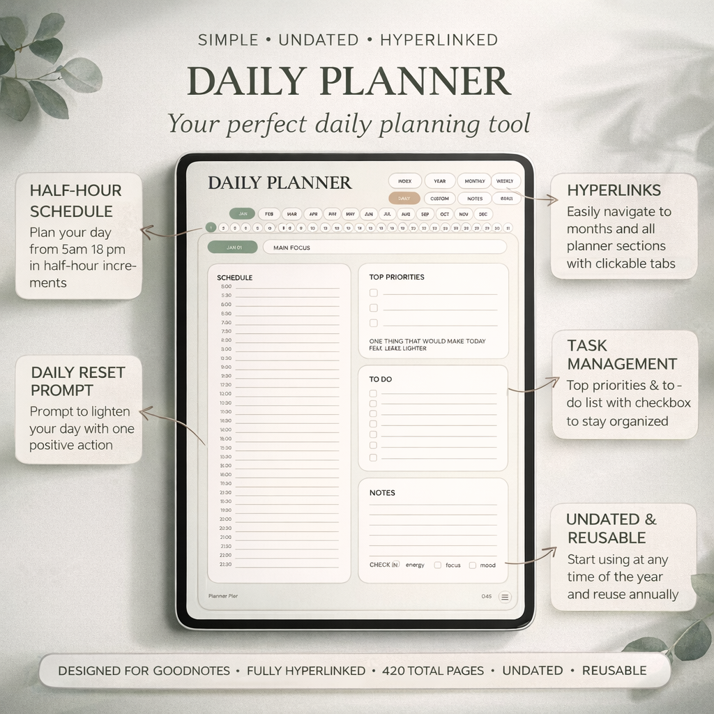
For most routines, the essential stack is simple: one monthly page to orient you, one weekly spread to make decisions, one daily page or focus area for action, and one notes space for overflow. That core covers more of real planning than most buyers expect. The monthly page helps you see deadlines and context. The weekly page decides what matters this week. The daily page narrows attention. The notes space catches the extra thinking that would otherwise clutter everything else.
A product like the Simple Undated Digital Planner for iPad is effective because it leans into that kind of practical structure. It gives the buyer enough room to work without implying that every life area must be tracked immediately. That is a stronger beginner and re-starter experience than a planner built around endless specialty inserts.
- arrow_right_altMonthly pages help you orient and review, not just admire a calendar.
- arrow_right_altWeekly pages are the true command center for priorities and follow-through.
- arrow_right_altDaily pages are most useful when you need focus, not when they become another performance ritual.
Product spotlight
A planner built around useful pages, not inflated page count
PlannerPier's Simple Undated Digital Planner is a strong fit for buyers who want monthly, weekly, daily, and notes structure without turning their planner into a template warehouse.
- check_circleUseful core layout for work, life, and routine planning
- check_circleLower-friction fit for beginners and re-starters
- check_circleA calmer alternative to insert-heavy competitor files
The optional pages that become valuable only for the right routine
Optional pages are not bad. They are powerful when they solve a real recurring need. Habit trackers matter when consistency is part of the problem you are solving. Budget pages matter when money visibility affects your stress. Project pages matter when work has moving parts. Wellness pages matter when your routines need energy, mood, or self-care support. The issue is not having optional pages. The issue is adding them before you know why they belong in your planner.
This is one reason many buyers feel both impressed and overwhelmed by competitor bundles. The inserts look generous, but the workflow burden lands on the user. They have to decide what matters, where it lives, and how it connects. PlannerPier can win by reversing that burden: teach the user which pages earn their place, then offer products and tools that make those decisions easier.
How to match planner pages to different life situations
A student may need assignment visibility and linked notes more than budgeting pages. A freelancer may need project checkpoints and meeting note access more than mood prompts. A parent may need a stronger weekly overview and household admin space. An ADHD user may need fewer layers, gentler tracking, and pages that make restarting easy. This is why universal page recommendations are often misleading.
The better method is to identify your repeat friction. What kind of information keeps slipping through? What decision feels harder than it should? What part of the week always gets messy? Once you know that, page selection becomes clearer. The planner is not supposed to represent your ideal self. It is supposed to support your actual life.
How to stop your planner from turning into a digital junk drawer
A planner starts to feel cluttered when every possible need gets solved inside the same file. Long-form notes, random lists, project thinking, therapy reflections, shopping plans, and quarterly goals all pile into one place. Over time the weekly pages lose clarity because too much support material is fighting for room. That is usually the moment users think they need another planner, when what they often need is better page boundaries.
This is where a companion product or tool can help. A notebook can hold deeper reference material. A tracker can live beside the planner instead of inside it. A custom page builder can help you test the exact weekly structure you need before rebuilding your whole system. That keeps the main planner clearer and much easier to reopen.
Where PlannerPier fits in this decision
PlannerPier's advantage is not only selling planners. It is helping users shape better planner systems. That makes this keyword especially valuable because the content can guide the reader from page confusion into a more deliberate layout choice. Someone who needs a calm all-round planner may choose the Simple Undated Digital Planner for iPad. Someone who needs more customization may be better served by a builder workflow first.
When the blog teaches page selection honestly, product integration becomes more natural. The reader feels less sold to and more helped. That is the kind of trust that improves both rankings and conversions over time, because the content answers the real question behind the keyword: what actually deserves space in my planner?
Frequently asked questions
What pages should a digital planner include?
Most people benefit most from monthly, weekly, daily or focus pages, plus a notes area and only the optional inserts that clearly match their routine.
Do I need lots of inserts in a Goodnotes planner?
Usually no. Too many inserts can create clutter and decision fatigue. A smaller, more useful page set often leads to better planning consistency.
How do I know which planner pages fit my life?
Look at your repeat friction. Choose pages that solve the planning problems you keep facing each week instead of pages that only look impressive in a listing.
Choose planner pages that make the week clearer, not busier
Explore PlannerPier at https://www.plannerpier.com/ if you want digital planners and tools built around useful page structure instead of filler inserts.