The smartest planner buyers do not start by asking which cover looks nicest. They start by testing what information their week actually needs and whether a planner layout supports it cleanly.
Want to test before you buy?
Build a sample planner layout in the Custom Planner Builder
PlannerPier's Custom Planner Builder helps you experiment with sections and planning structure so you can buy with clearer intent.
Open Custom Planner BuilderWhy so many people buy beautiful planners they do not keep using
Digital planner buyers often make a perfectly understandable mistake. They shop for the feeling of being organized instead of the structure that will actually support organization. A beautiful cover, polished tabs, and a long feature list create confidence in the moment, but they do not guarantee weekly usefulness. A planner can look premium and still fail because it does not match how the buyer thinks, schedules, or takes notes.
That is why the idea of testing a custom digital planner before purchase matters. The buyer is usually trying to reduce uncertainty. They know that layout matters, but they do not yet know what kind of weekly page, notes space, or task structure will feel natural after the novelty wears off. A short testing process can reduce that risk dramatically.
Start with the friction in your current planning system
Before looking at templates, ask where your current system fails. Do tasks disappear between brain dump and schedule? Do you need more notes space? Do you avoid daily pages because they are too rigid? Do project details crowd your weekly view? Do habits and goals need a dedicated area, or are they only creating guilt? These questions are more useful than scrolling through inserts at random.
Once the friction is named, layout choices become easier. A user who constantly loses project context may need a notebook companion or stronger notes section. A user who feels overwhelmed by dated structure may need an undated weekly system. A user who relies on home admin may want a small meal or errands block in the weekly page. This is where tool-led discovery becomes much more valuable than static product grids.
- arrow_right_altIdentify the point where your current planning process consistently breaks down.
- arrow_right_altName the page element that would reduce that friction most clearly.
- arrow_right_altIgnore features that look impressive but do not solve your real weekly problem.
What to test in a custom planner layout before spending money
A pre-purchase planner test should focus on four things. First, does the weekly layout match how you think: time blocks, task buckets, priorities, or a mix? Second, do you have enough room for notes without cluttering the action space? Third, can the layout handle ordinary interruptions like missed tasks or changing appointments? Fourth, does the file feel quick to reopen on iPad, or does it already feel like another thing to manage?
These criteria matter because buyer regret usually comes from subtle mismatch, not from obvious defects. The planner technically works, but it asks the user to think in a way that does not fit their life. If PlannerPier helps shoppers notice that before purchase, conversion quality improves because the eventual product recommendation feels more accurate and more trustworthy.
Why interactive planner tools outperform static comparison shopping
Static product pages are useful, but they still ask the buyer to imagine themselves inside a workflow they have not tested. Interactive tools reduce that gap. When a user can choose weekly sections, compare page elements, or answer a short quiz about their routine, they learn something about their own planning style. That learning makes the eventual purchase more confident.
This is a major strategic advantage for PlannerPier. Tools like the [Visual Planner Page Builder](/tools/visual-planner-page-builder) and [Custom Planner Builder](/tools/custom-planner-builder) do more than entertain. They capture intent, reduce buyer hesitation, and move the conversation from generic planner shopping to personalized workflow design. That is hard for competitor marketplaces to replicate with static listings alone.
How to move from a tested layout to the right PlannerPier product
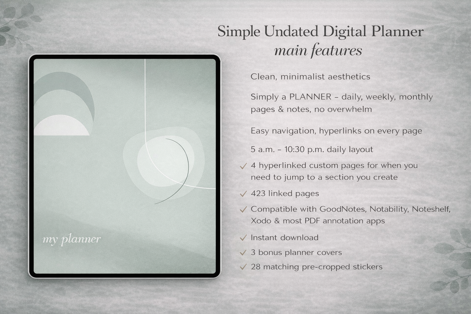
Once the buyer understands their own layout needs, the product fit becomes clearer. If they need a calm all-purpose weekly system and flexible restart points, the Simple Undated Digital Planner is often the best next step. If they want a broader starter package with coordinated assets, the Ultimate Planner Bundle may be the smarter option.
If the buyer's challenge is not the planner itself but the supporting workflow, PlannerPier can recommend tools first. Someone unsure about their weekly design may use the builder before buying. Someone overwhelmed by choosing among products may start with [Find Your Planner](/tools/find-your-planner). This reduces pressure and keeps the brand positioned as a helper, not just a seller.
How PlannerPier should frame the CTA for this search
The right CTA here is not 'buy now.' It is 'test first, then buy with more confidence.' That matches the emotional state of the searcher. They are curious, but cautious. They want to avoid choosing wrong. A softer conversion path makes sense because the tool experience itself increases readiness.
That means the article can educate first, let the user test layout choices, and then naturally route them toward the best-fit product. This is exactly the kind of search where PlannerPier's platform model creates leverage. The content, tools, and product pages work together as one buying journey rather than as isolated pages.
What buyers should notice after a successful planner test
A useful planner test usually produces a few concrete insights. Maybe you discover that you need more notes space than expected, that time blocking works better than a long task list, or that you actually prefer a simpler weekly page with one priority area. These insights matter because they turn planner shopping into a decision based on self-knowledge instead of guesswork.
That is also the moment when soft conversion works best. Once the buyer can describe what they need, PlannerPier's product recommendations feel sharper and more trustworthy. The sale no longer depends on hype. It depends on fit. That is healthier for rankings, user satisfaction, and repeat purchase behavior over time.
Frequently asked questions
How can I test a digital planner before buying?
The most useful test is to review your weekly friction, try a page-builder style tool, and check whether the layout supports tasks, notes, and interruptions the way your real routine requires.
Should I build a custom planner or buy a ready-made one?
Many people should test the layout first and then decide. A ready-made planner is often enough once you know your needs clearly, while a custom builder helps when your routine is more specific.
What is the biggest mistake when buying a digital planner?
Choosing mainly by aesthetics or page count instead of by workflow fit is one of the most common reasons buyers stop using a planner after the first few weeks.
Test the layout first, then choose the planner that actually fits your week
Visit PlannerPier at https://www.plannerpier.com/ to explore planner tools, custom builders, and digital planners designed to match real iPad workflows more closely.